Process: PRINT Magazine Cover and Spread
In this post, I will discuss my creative process behind the concept for the PRINT Magazine Cover and Spread, from research and sketches to final touches.
First, I started out with research into magazine covers and spreads. Many magazines have prominent imagery, and establish effective grids within spreads that can be more structured or playful depending on the topic being discussed.
In this case, I chose David Carson to be the main feature on the magazine cover and spread concept because I admire his use of type as texture. His work is chaotic but still has a structure to it, and often provokes specific emotions.


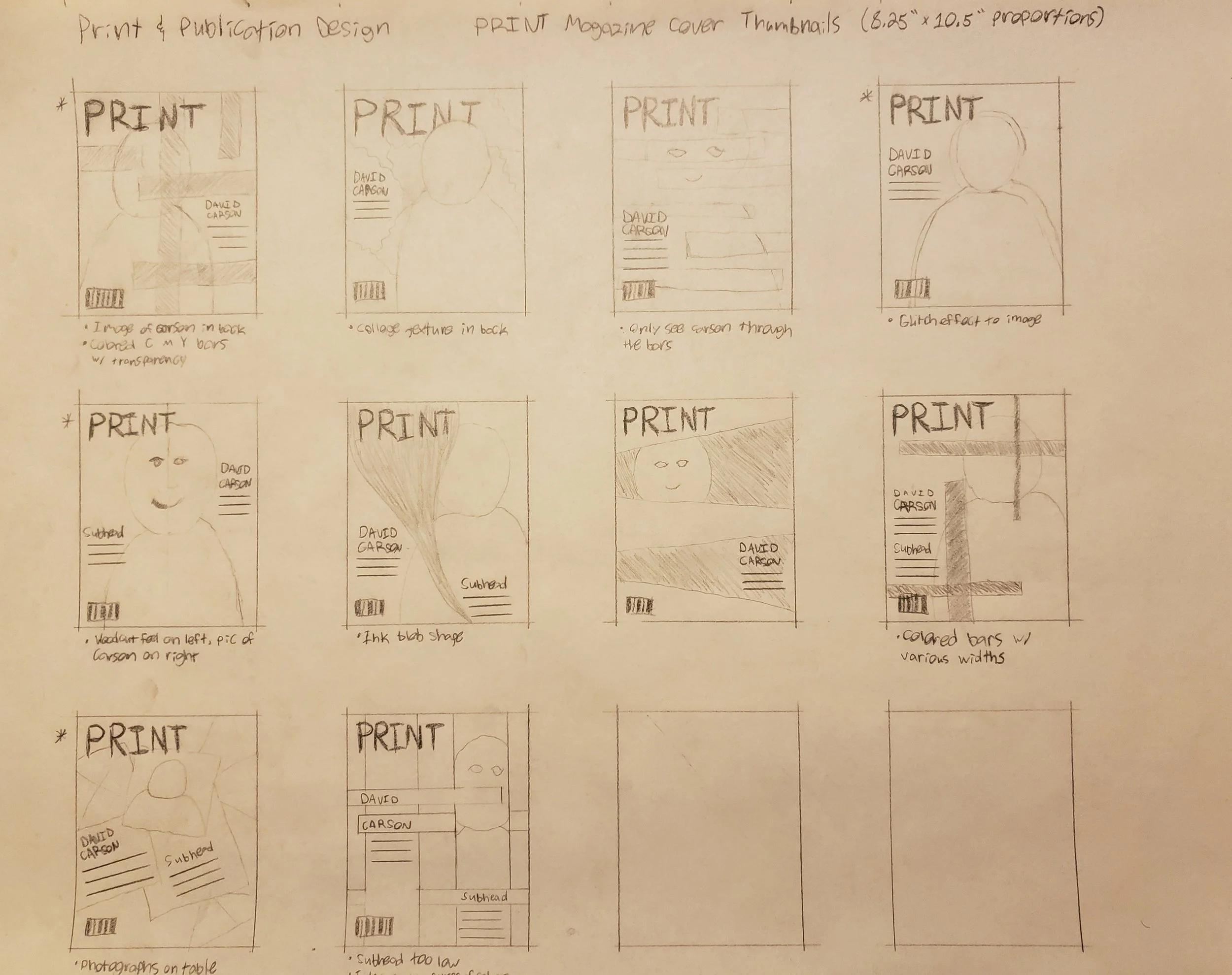
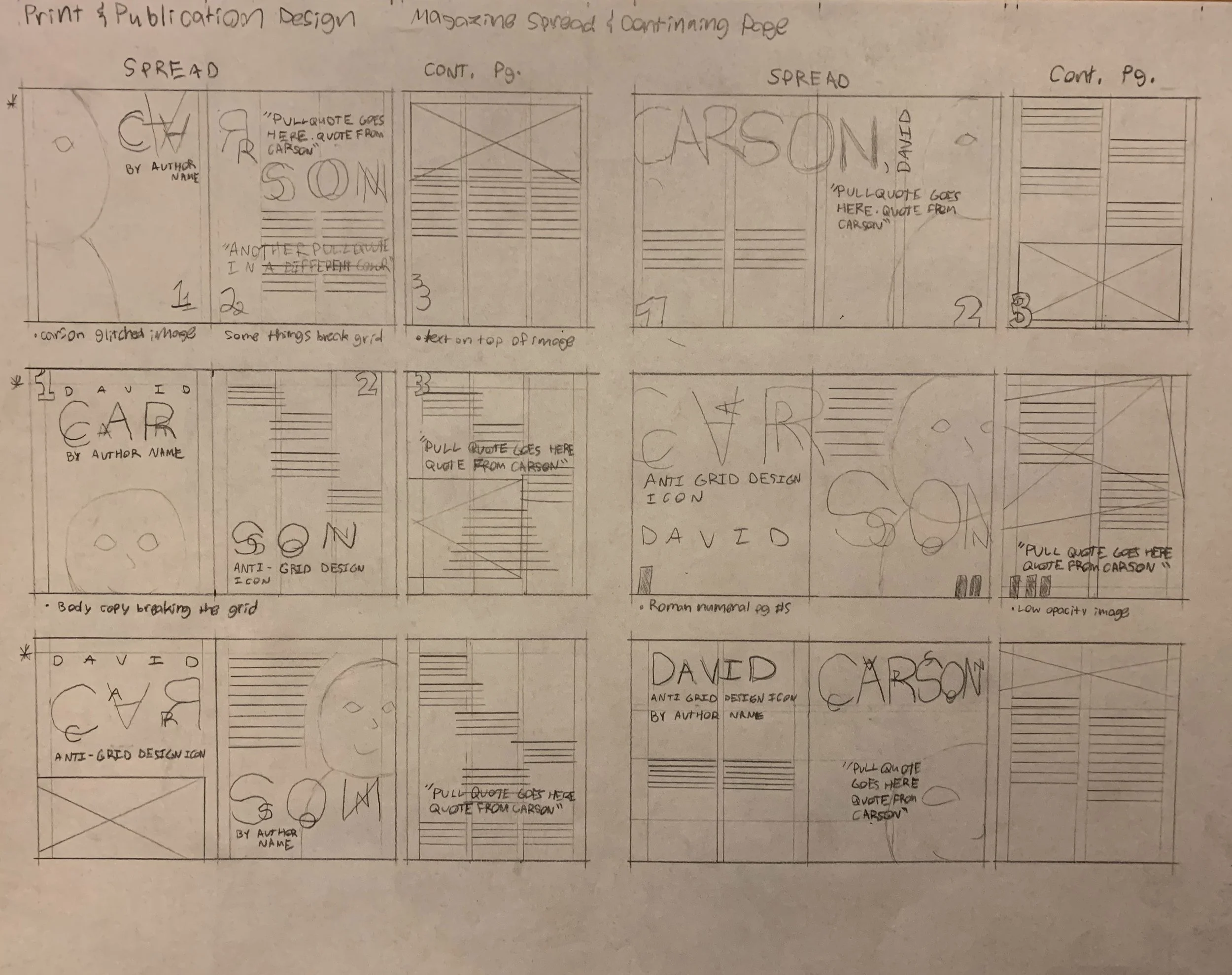
Next, I brainstormed layout ideas through sketches. I prefer sketching with pencil and paper whenever possible, as it allows me to focus on composition without the distractions of digital tools like selecting colors, typefaces, and other design elements. This hands-on approach helps me stay in the creative flow and think more freely. It also allows me to refine my ideas, selecting the most effective ones to create digital roughs.
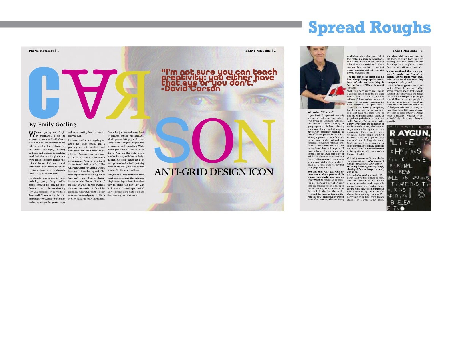
Once I’ve narrowed down my sketches to the most effective compositions, I create digital roughs. In this step of the process, I’m able to further explore ideas, choosing colors and typefaces that will work best.
I wanted to have a mix of fonts and use type as texture as a nod to Carson’s work. I also wanted to allude to PRINT Magazine, so I chose to use the four print colors: cyan, magenta, yellow, and black.


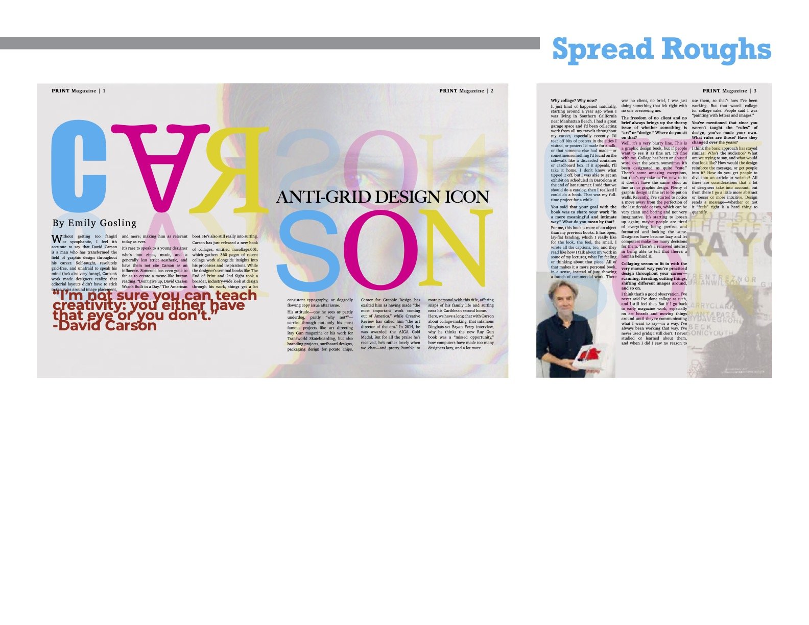
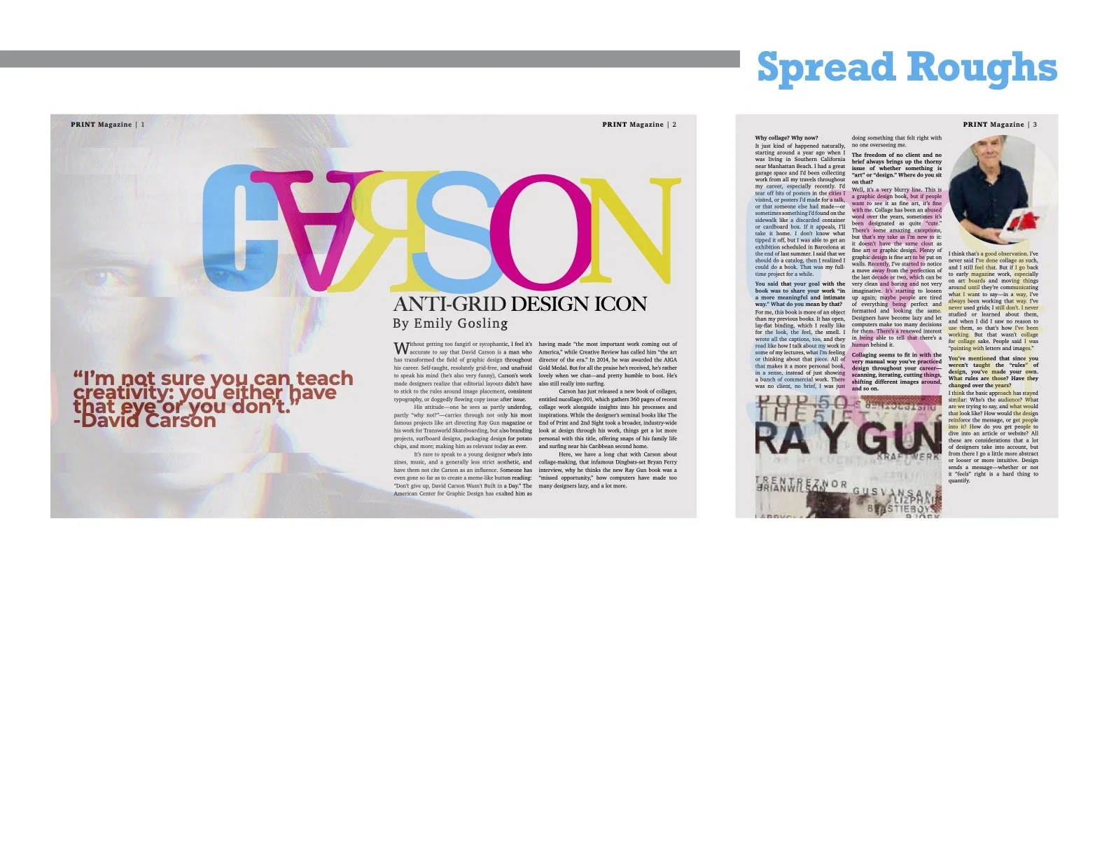
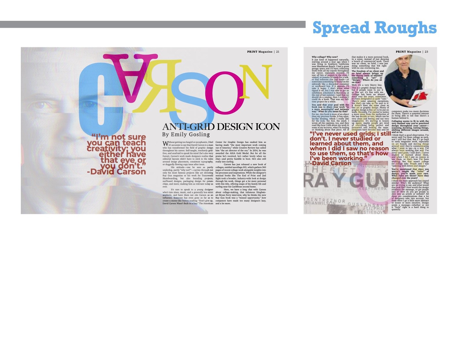
Choosing the best direction and refining that concept is the final step in my creative process.
The end result has prominent imagery and uses type as texture, nodding to Carson’s anti-grid style. The spread is playful but structured in order to convey the information in the article.
