Case Study: WNYDEC Logo Development
In this case study, I will dive into the process of developing a logo for a local nonprofit organization in the Western New York area.
Western New York Digital Equity Coalition (WNYDEC), which was previously known as Western New York Digital Inclusion and Equity Coalition, is a nonprofit that promotes digital equity and inclusion for all residents in the WNY area. The need for such an organization arose during the COVID-19 pandemic, in which the use of technology and digital platforms increased drastically. This nonprofit aims to increase digital literacy amongst those who previously have had little to no experience using computers, smartphones, and so on.
During my senior year at Villa Maria College, the opportunity presented itself to develop a logo for WNYDEC while I was in a Senior Portfolio Review class. This was a new organization, so a visual identity was needed. My peers and I each developed a logo concept and presented it to the client. After they reviewed the concepts with their team, they chose the logo that I designed.
The first step in the process was to research the target audience and similar organizations. For WNYDEC, the target audience includes local individuals who aren’t as familiar with newer technologies and need help understanding how to operate them. Policy makers, funding entities, and government regulators are also within the audience. A direct and local peer organization, Mission Ignite, has a similar mission and target demographic. The logo needed to be friendly and welcoming, while also establishing authority and leadership.
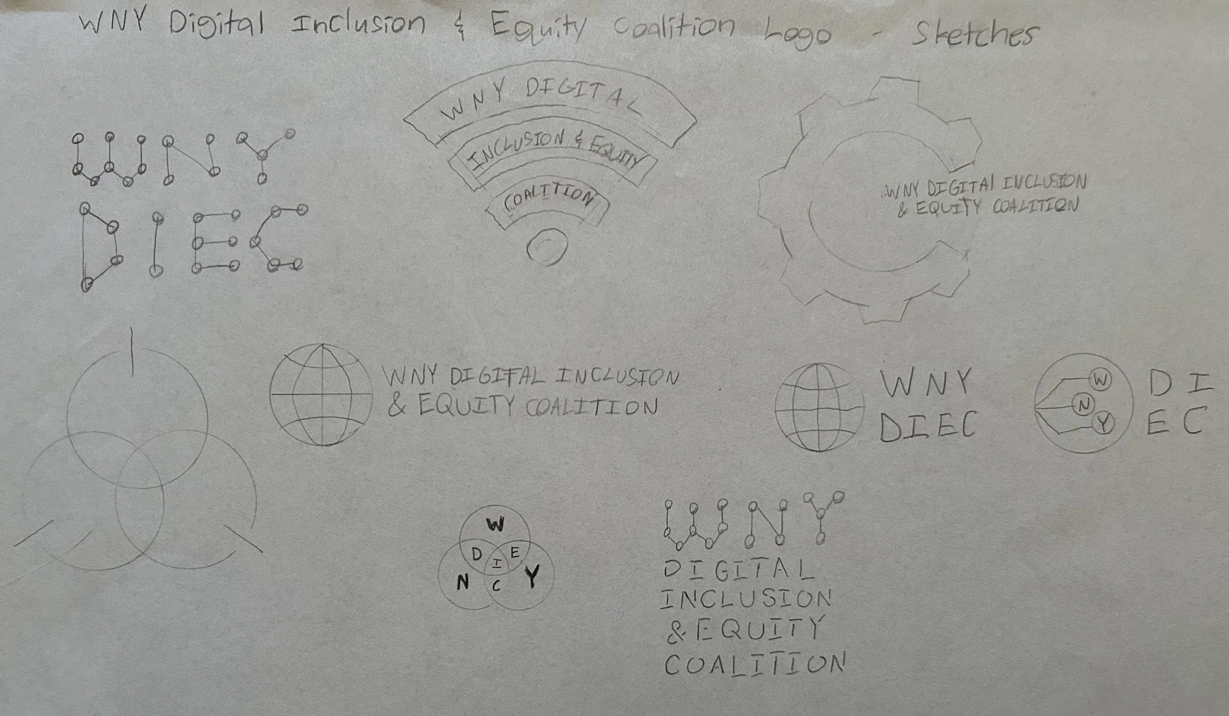
After completing the research phase, I transitioned to brainstorming ideas through sketches. The concepts that were the strongest were the ones that featured “nodes,” so I decided to expand upon that idea.
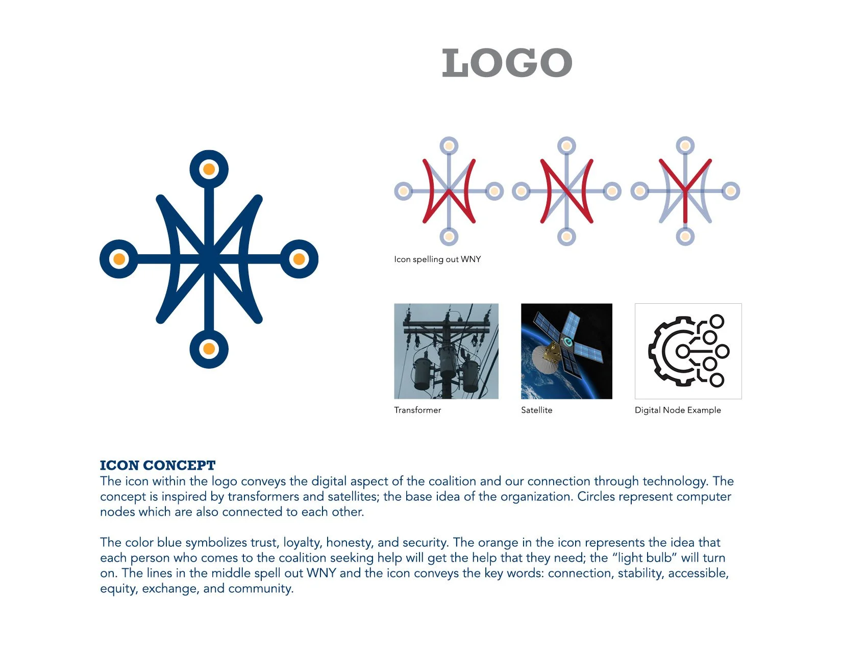
While exploring the node concepts, I thought about technology and how it has revolutionized modern society. It connects us in ways that were previously unheard of, and it has created a community that expands the entire globe. This served as the main inspiration for the logo’s icon, and a satellite and transformer were used as visual references. I also wanted to represent the location that WNYDEC is based out of, so within the icon, the letters “WNY” can be found. Keeping in mind that the logo needed to be friendly and trustworthy, I chose a deep blue to be the main color in the logo.
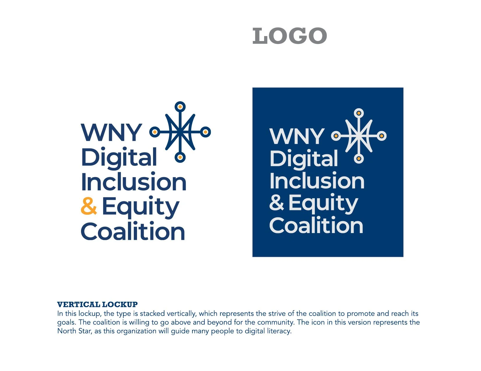
The typeface I chose for the logo is Montserrat because it has a friendly and welcoming tone while still feeling stable and professional. To ensure that the logo was versatile, both horizontal and vertical lockups were created, as well as reversed versions.
The final product was successful in relaying WNYDEC’s mission, and connects to many of the key words that were established at the beginning of the project. It has a welcoming and trustworthy tone and conveys a sense of connection and community. Once the client chose this logo concept, I delivered a full logo suite for their use and thus completed the project.


